

Over 16 years of street style, captured in various towns around the world.
Month
- November 2026 4
- October 2026 6
- September 2026 6
- August 2026 9
- July 2026 13
- June 2026 12
- May 2026 11
- April 2026 7
- March 2026 13
- February 2026 15
- January 2026 21
- December 2025 23
- November 2025 19
- October 2025 22
- September 2025 22
- August 2025 21
- July 2025 24
- June 2025 20
- May 2025 22
- April 2025 22
- March 2025 21
- February 2025 20
- January 2025 20
- December 2024 15
- November 2024 21
- October 2024 21
- September 2024 21
- August 2024 16
- July 2024 16
- June 2024 19
- May 2024 22
- April 2024 22
- March 2024 18
- February 2024 19
- January 2024 17
- December 2023 10
- November 2023 18
- October 2023 18
- September 2023 15
- August 2023 21
- July 2023 21
- June 2023 20
- May 2023 21
- April 2023 20
- March 2023 20
- February 2023 20
- January 2023 19
- December 2022 16
- November 2022 22
- October 2022 20
- September 2022 13
- August 2022 14
- July 2022 11
- June 2022 12
- May 2022 13
- April 2022 11
- March 2022 13
- February 2022 8
- January 2022 10
- December 2021 7
- November 2021 12
- October 2021 11
- September 2021 22
- August 2021 22
- July 2021 23
- June 2021 18
- May 2021 17
- April 2021 17
- March 2021 23
- February 2021 14
- January 2021 15
- December 2020 19
- November 2020 9
- October 2020 11
- September 2020 9
- August 2020 11
- July 2020 15
- June 2020 13
- May 2020 3
- April 2020 1
- March 2020 16
- February 2020 19
- January 2020 21
- December 2019 9
- November 2019 21
- October 2019 23
- September 2019 18
- August 2019 22
- July 2019 23
- June 2019 19
- May 2019 23
- April 2019 21
- March 2019 20
- February 2019 19
- January 2019 19
- December 2018 14
- November 2018 21
- October 2018 22
- September 2018 21
- August 2018 23
- July 2018 29
- June 2018 21
- May 2018 23
- April 2018 20
- March 2018 22
- February 2018 20
- January 2018 19
- December 2017 17
- November 2017 22
- October 2017 23
- September 2017 21
- August 2017 23
- July 2017 22
- June 2017 22
- May 2017 23
- April 2017 19
- March 2017 23
- February 2017 22
- January 2017 17
- December 2016 10
- November 2016 21
- October 2016 23
- September 2016 28
- August 2016 26
- July 2016 24
- June 2016 20
- May 2016 25
- April 2016 22
- March 2016 30
- February 2016 30
- January 2016 22
- December 2015 25
- November 2015 44
- October 2015 50
- September 2015 46
- August 2015 45
- July 2015 38
- June 2015 39
- May 2015 36
- April 2015 56
- March 2015 43
- February 2015 29
- January 2015 36
- December 2014 28
- November 2014 25
- October 2014 32
- September 2014 36
- August 2014 30
- July 2014 41
- June 2014 37
- May 2014 36
- April 2014 39
- March 2014 29
- February 2014 39
- January 2014 34
- December 2013 32
- November 2013 56
- October 2013 45
- September 2013 45
- August 2013 35
- July 2013 18
- June 2013 23
- May 2013 31
- April 2013 60
- March 2013 39
- February 2013 25
- January 2013 23
- December 2012 12
- November 2012 18
- October 2012 28
- September 2012 34
- August 2012 22
- July 2012 26
- June 2012 16
- May 2012 27
- April 2012 15
- March 2012 14
- February 2012 22
- January 2012 14
- December 2011 24
- November 2011 24
- October 2011 32
- September 2011 53
- August 2011 18
- July 2011 6
- June 2011 8
- May 2011 13
- April 2011 13
- March 2011 16
- February 2011 18
- January 2011 7
- December 2010 4
- November 2010 5
- October 2010 3
- September 2010 3
- August 2010 4
- July 2010 1
- April 2010 1

Wyatt Mitchell in New York
Wyatt Mitchell in New York
Published in print, June 2015.
Words by Dan Rookwood
Photography by David Urbanke
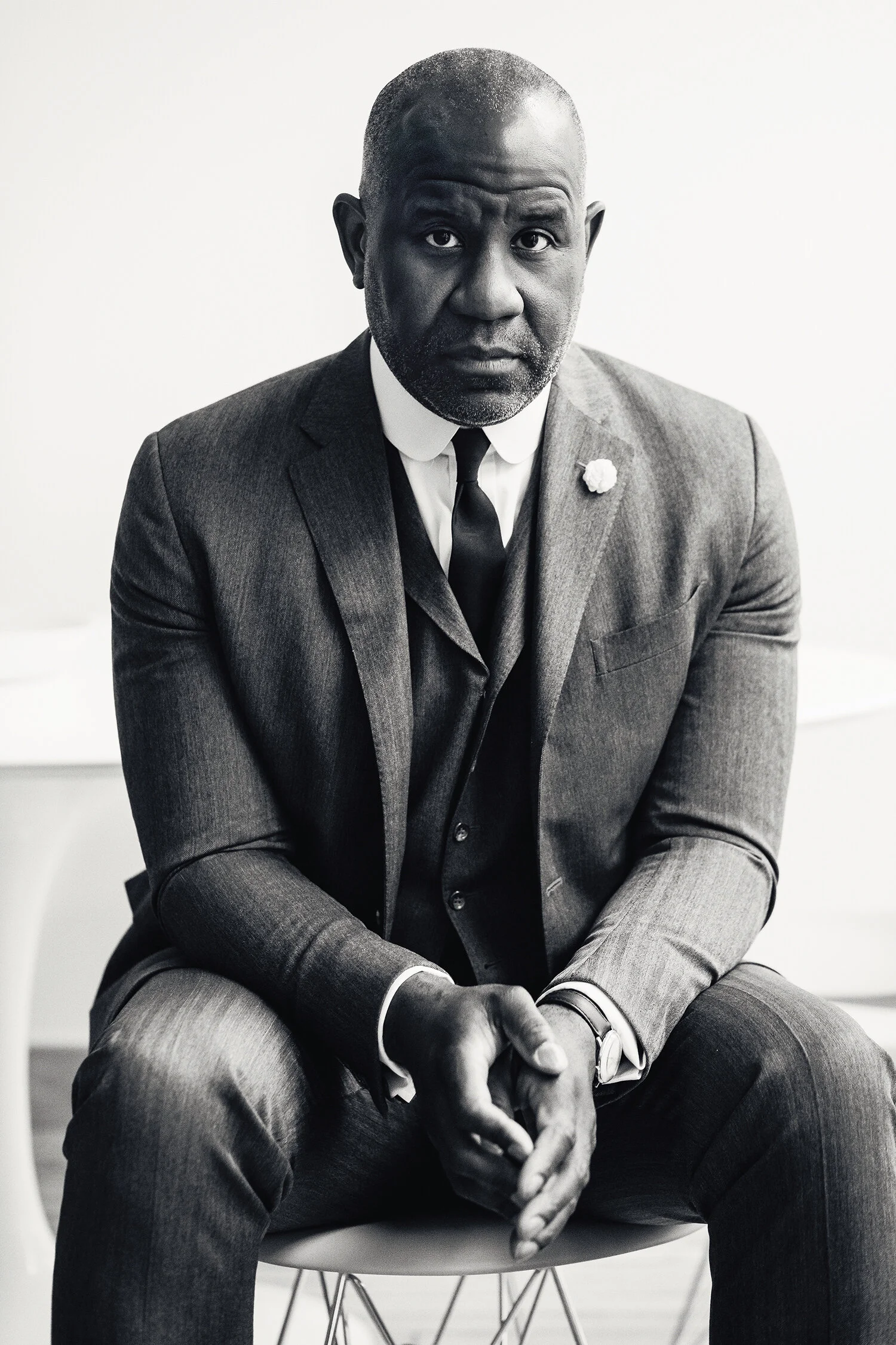
Wyatt Mitchell is not just a New Yorker, he is The New Yorker. As the iconic magazine’s first creative director in its 90-year history, he is the aesthetic custodian of a much revered and respected literary institution. Mitchell is also the best-dressed man at Manhattan’s most fashionable address—One World Trade Center, the new home of Condé Nast magazines— which is where MITT met with him.
“If I drink a coffee, I might die,” says Wyatt Mitchell while perusing the barista’s menu. “Seriously. My heart can’t take caffeine. But I will have a herbal tea.”
We are sitting in the Condé Nast cafeteria on the 35th floor of the tallest building in the western hemisphere, the newly opened glass-and-steel 1,792-foot exclamation point that dominates the skyline where the Twin Towers once stood.
This cafeteria is the hallowed water-cooler where editors and creatives of the world’s most powerful and iconic magazines—from Vogue to Vanity Fair to GQ to, yes, The New Yorker—congregate to chew anything but the fat. A fashion fishbowl, it thrums with Prada-wearing devils power-lunching on their vanity fare of kale and quinoa salads and pressed juices.
The coolest man in the room is Mitchell. On the day we meet, the six-foot-something 48-year-old is wearing a daring double-denim combo of indigo chore jacket and jeans with a white dress shirt and black tie—an unusual high-low ensemble, but it works. The look is accessorised with a silver tie slide and poking out from his chest pocket is a pencil sharpened to a spike. He looks just as sharp.
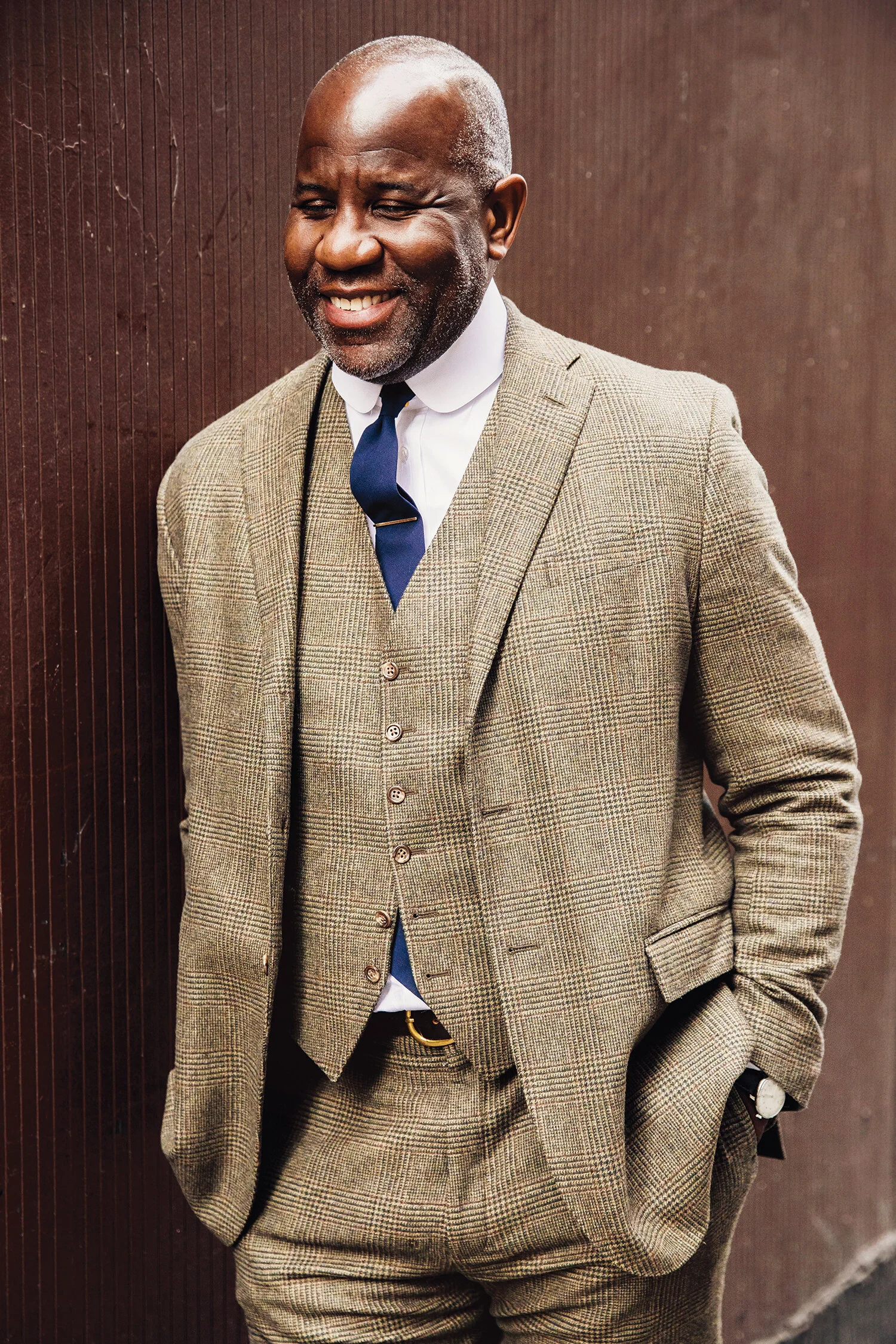
Mitchell is more usually attired in a suit—often a three-piece—worn with a hat except during the sticky heat of a New York summer. He wears his shirts buttoned up—sometimes with a tie, sometimes with a bow tie, often without a tie at all.
“I work at The New Yorker, which is a respected institution, and I want to do it proud, so I account for that in my style,” he explains. “I like a turn-of-the-century look. I think there was a certain decorum with dressing in suits and hats back then. I like the idea that men who wore suits every day had a respectability about themselves, a respect for work, and a respect for other people.”
“Wyatt is a gentleman from another age, an old soul in a young man’s body,” says his friend and former boss Scott Dadich, the editor-in-chief of technology magazine WIRED. “He has such a singular style, sort of a timeless mash-up of Boardwalk Empire meets Cool Hand Luke: textural mixing with classic pieces and odd flourishes. I couldn’t pull off half of what he wears, but I do aspire to being as comfortable in suits as he is.”
Up until carrying out a recent inventory when he moved apartments, Mitchell owned more than 70 suits
—a lifelong collection. He’s since edited it back to 41. “This is the embarrassing part about being my age: many of those suits I could no longer wear. I just had an attachment to them in the hope that one day I lose some weight and I can put them back on. Of course, I’ve kept a lot of them because I love those suits. I love them.”
Mitchell describes his wardrobe as organised and orderly but not obsessively so. His new apartment, a short walk from Union Square, is a clutter-free haven of clean modern minimalism. “I live in a crazy city so I like to treat a home as a kind of quiet, peaceful, reflective sanctuary,” he says. “I need the room cleared to breathe. I like space.”
What does the creative director of The New Yorker—a man with direct access to some of the world’s best photographers, illustrators and artists—choose to have on the walls of his apartment? “More than anything I have photographs of jazz musicians. I have a wonderful picture of Bill Evans, the piano player, taken by Jim Marshall, which I was lucky to get before Jim passed away. It is signed by him and it is beautiful—one of my most treasured things. I have a Frank Sinatra photo, I have a Duke Ellington photo, I have a Dizzy Gillespie photo …”
Music is Mitchell’s great passion in life, jazz in particular. For a long time when growing up, he worked in record shops. “I’m one of those people,” he says. He feels that today’s instant, easy access to limitless music via digital services such as Spotify has diminished the experience of personal discovery.
“I spent so much of my life finding music. Part of the enjoyment was not just listening to it, but the searching for it in the first place. I remember looking for a Nick Drake box set—what’s it called? Fruit Tree—on vinyl, which was really hard to find. I finally found it and I just could not have been happier that day. It must have taken 10 years to find that. I have now digitized all my music, but I’ve kept any CDs or records where there was a journey or a difficulty in finding the artefact.”
Mitchell has also taught himself to play various musical instruments over the course of his life. “I played the trumpet unsuccessfully in high school. And then I was fascinated by the bass guitar and taught myself that for a few years. Now I play the piano, and my goal is to slowly teach myself jazz piano so that, at the point of my death, I will be at my best … just as I sort of drift off. I have no ambition to have a gig, but I do want to get better and better and better.”
“He should be in a jazz band,” says Dadich later over email. “He’s too modest, but very, very good.”
Growing up as an only child in small-town Ohio, Mitchell spent a lot of time by himself. There is a theme running through his life of picking things up that interest him, spending time learning to work them out, giving them a go. This is how he got into the world of design in the first place. “Yeah, I did not go to art school at any point,” he explains. “I remember that one day someone came in with a Macintosh computer and said: ‘We need a desk to put this on. We can’t find a place to put it.’ I said: ‘Put it in my office.’ Only because I liked the idea of swivelling around in my chair between my two computers. So they put it in there and I played around with it and started to learn some of the software and thought, ‘Wow, this design stuff is kind of cool!’ And that’s how I began on the path.”
Up until that point, Mitchell had been working as a quantitative analyst—an economist—crunching numbers. It sounds a million miles away from design, but Mitchell can see a parallel between the two disciplines. “To me, they’re very much the same idea,” he says. “A magazine story or, indeed, an entire magazine is a complex mix of data. It needs someone or a group of people to synthesise it and make it presentable and digestible so that the reader can enjoy it without finding it overbearing and oppressive.”
He moved into working on the production side of publishing on magazines such as DETAILS, Vibe and Esquire, picking up tips from the magazines’ designers as he went. With no formal training, he learned on the job until he was skilled enough to transition into design.
It’s an approach that has served Mitchell well. “He’s self-taught in so many ways, and with it comes a natural boundary-busting tendency,” says Dadich. There is a freedom of expression and approach that comes with someone who has natural flair rather than strictly trained ways.
To date, he has amassed an impressive 70 awards, including an unprecedented three consecutive design ASMEs (the award of the prestigious American Society of Magazine Editors) and three consecutive Society of Publication Designers “Magazine of the Year” titles for his innovative work at WIRED.
His current job would seem much more restrictive on the (type)face of it. He is tasked with modernising and evolving a venerable old title while retaining its visual character and DNA. Does he find it creatively inhibiting? “The New Yorker is the perfect job for me right now, after having been at WIRED, which was much more free, much more innovative, much more experimental,” he replies. “This is a job where I’m not designing for awards or for flash or for self-recognition; I’m designing to make this iconic brand better.”
No more free-form experimental solos; now he’s playing the well-known jazz standards. “This job is about the improvement of something that is revered and regarded and isn’t broken. So, it’s a more thoughtful, smarter type of design and, in some respects, more delicate, because mistakes have a larger effect with a brand like The New Yorker. At WIRED, you can make a mistake and then, next month, you try something different and readers expect that or understand that. The New Yorker readers are not as forgiving.”
From Mitchell’s office window, he enjoys a toy-town view of lower Manhattan and the Hudson River. “The window is perfect,” he says. “I draw a lot of inspiration from looking around me, aware and observing. I get most of my creative inspiration from just walking around, being on the subway, overhearing a conversation, listening to music, seeing this movie, just living. Part of my job is about creativity and, therefore, I have to give some room for that to sort of bubble up.”
The musical riff returns. Mitchell likens his job as a brand leader to being a jazz bandleader. “I want people to understand what the mission and philosophy is behind what we’re doing—then improvise.”
When does he do his best work? “I think better in the morning. I have brilliant ideas in the shower. I’m at my clearest. But I might be more creative in the evening time with music playing. I think there can be a distinction between the two.”
Just don’t give him any coffee.
END


Love Letter: Modern Jazz Quartet
Love Letter: Modern Jazz Quartet

Published in print, September 2019.
Words by Gabriel Jermaine Vanlandingham-Dunn
It was around 2004 that I was invited to an intro photography class at a local community college in Baltimore, Maryland. My dear friend, the late Alan Rutberg, taught the class and he’d asked me to talk with his students about album cover photography and how powerful it could be. Having collected records, mainly jazz, for most of my life, he felt that my background in Africana Studies would help his students understand how art reflected and impacted the Black American experience. I was honoured by his request and knew exactly which record I wanted to talk about. I arrived to the class with a beautiful copy of the Modern Jazz Quartet’s self-titled LP (Atlantic, 1957) in my bag.
I wish I could tell you exactly how I came to know the MJQ. It might’ve been me stumbling upon a copy of Milt Jackson With John Lewis, Percy Heath, Kenny Clarke, Lou Donaldson And The Thelonious Monk Quintet (Blue Note, recordings from 1948 and 1951-2, released in LP format in 1955). Or maybe it was my former boss hipping me to their airy masterpiece Space (Apple, 1969). But more than likely it was the constant search for samples used in my favourite hip-hop songs that got me to know them (Pete Rock, No ID, DJ Premier and Diamond D made good use of their spacious sound). I could easily nerd out on them for days, but I’ll drop a few facts and get back to my story.
The group was founded around 1952 with John Lewis on piano, Milt Jackson on vibraphone, Percy Heath on bass (who replaced Ray Brown) and Kenny Clarke (who was replaced by Connie Kay in 1955). Lewis and Jackson (along with Brown and Clarke) played together in Dizzy Gillespie’s large ensemble and first started playing as the Milt Jackson Quartet. Their sound was unique, marrying the jazz and blues experience with euro classical sensibility. For this, all listeners didn’t love them. In fact, when Kenny Clarke departed the group, he left emphasizing that he couldn’t stand playing the music anymore. Yet they became very popular for their special renditions of standards and original compositions such as Django, Bag’s Groove, Ralph’s New Blues, Fontessa and La Rhonde. The switch from the independent Prestige label to the major powerhouse Atlantic Records in 1956 brought the group to a wider audience and allowed them to tour internationally.
I explained some of these things to the (mostly teenage) students that afternoon, but they didn’t seem to understand the significance, until I reminded them about the era in which the MJQ came about. Although no period has been easy for us Black folk in the States, the 1950s in particular were no joke. There were many changes happening around the world, and while many white families were enjoying the expansion of the middle class, the civil rights movement began in earnest. The students and I made a brief timeline to create a better understanding of the importance of representation concerning Black folk during the time when the biggest stars of the day were Marilyn Monroe and Elvis Presley. With all this in mind, I then asked them to look at the self-titled cover, emphasizing its production in the year 1957.
The first word that comes to mind is dignity. These beautiful brothers are dressed sharply in dark suits (very rarely did you see them not wearing perfectly fitted three-pieces). The backdrop of the shot is a dark maroon that matches their ties. Fresh haircuts align their domes, while Lewis and Heath sport full beards. Jackson looks extra professorly with his specs (like the style worn by Malcolm X). All eyes are locked on photographer Fabian Bachrach’s lens. In short, these brothers did not come to fuck around. Though their music was perceived as commercially aimed, they were not only serious about their craft, but also their image as Black men in America. In a decade where many jazz musicians were getting their cabaret cards revoked (a racist system that deserves its own essay) and being limited to gigging for pennies, these cats began touring the world, representing the greatness of Black men’s strength and beauty in the process.
When breaking down these observations to the class, it made more sense to them why I’d connected with the image. Growing up there were plenty of positive images of Black men in my community, yet the media mainly perpetuated stereotypes and criminality. During the era that gave birth to the television, album covers mattered very much. The artwork not only sold a product, but it also allowed artists — those lucky enough — to be seen as they wanted to be seen. This text-less cover comes across as a triumph of the day; a salute to the ancestors, but also a cementing of a long-lasting presence of Black genius. The Modern Jazz Quartet played together for almost 50 years, taking breaks while each member recorded plenty of material outside of the group. I can’t help but think that this image, along with their lengthy discography, inspired many more brothers to make sure that they are seen and heard with respect, on their own terms, every place that they travelled.
END
